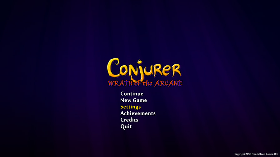
I hate drawing logos. It feels like you spend hours of your day spinning your wheels, fretting over serif versus sans-serif, twitching between 3-point kerning and 4-point kerning. It’s mind-numbing. But, in the end, you end up making something pretty good looking. It’s a thankless job. I’d never want to be a typographer.
Here’s some semi-final concept art of the main menu and logo.


